
How to Align Text: To the Block or the Left?
Block alignment is commonly used in magazines, books, and PDFs. The text is beautifully aligned – the first letters of each line start in the same position from the left, and the last letters of each line end in the same position from the right. The whole paragraph looks like a rectangle and it looks aesthetically pleasing. But is it appropriate to use block text alignment on the web as well?
Newspapers vs. screens text alignment
The classic screen works on the principle that the bright areas are the result of individual pixels shining through. The display area is therefore lit and is not as pleasant to look at as the color on the paper. The individual pixels on many screens are larger than the smallest dot used in printing.
For these reasons, a larger text size is used on the screen than in print. And the larger the text size, the fewer words fit on a single line. Some devices, especially phones, have screens that are too small to have lines wide enough to fit as many words as in print. And larger screens shouldn’t increase the width of individual lines too much, as the reader would then have to move their head around too much.
So in effect, there are fewer words per line on the screen than in print. And since the principle of block alignment is to adjust the text so that the beginning and end of the line line line up, the spacing between the words has to be increased (if the spacing between the letters or the width of the letters themselves were increased, it would be much more unreadable, but also much less aesthetically pleasing).
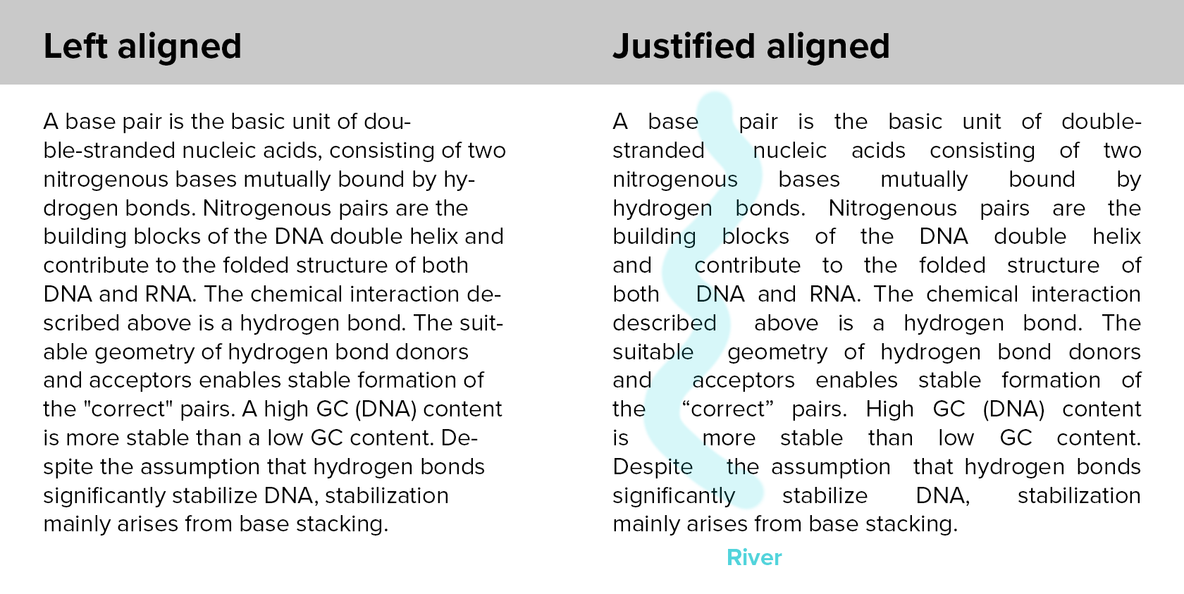
River effect
If the space between the words gets too large, the text itself reads less well and takes longer to read. In addition, with smaller line widths or longer words, these gaps become even larger and the result is less aesthetically pleasing, which can create a ‘river effect’.
User friendliness and text alignment
Most importantly, the text should be accessible to people with visual difficulties or dyslexia. If you choose block alignment because you can read the text without difficulty, this does not mean that it will not cause problems for other people.
For example, for the dyslexics mentioned above, even without this, the spacing between letters and words is visually increased and decreased. Such alignment makes the text almost illegible for them.
You won’t find block alignment in WordPress either
For all these reasons, it is recommended to use only left, right, or center alignment on web pages. That’s why you won’t even find block alignment among the default options in the WordPress editor, for example.