
Trends in graphic design (not only) for 2024
What did we see in graphic design in 2023 that we expect will still be popular and relevant in 2024? You will find neo-brutalism, Y2K, or Art Deco in my selection. Look at what characterizes these styles and where they are used everywhere.
Neo Brutalism
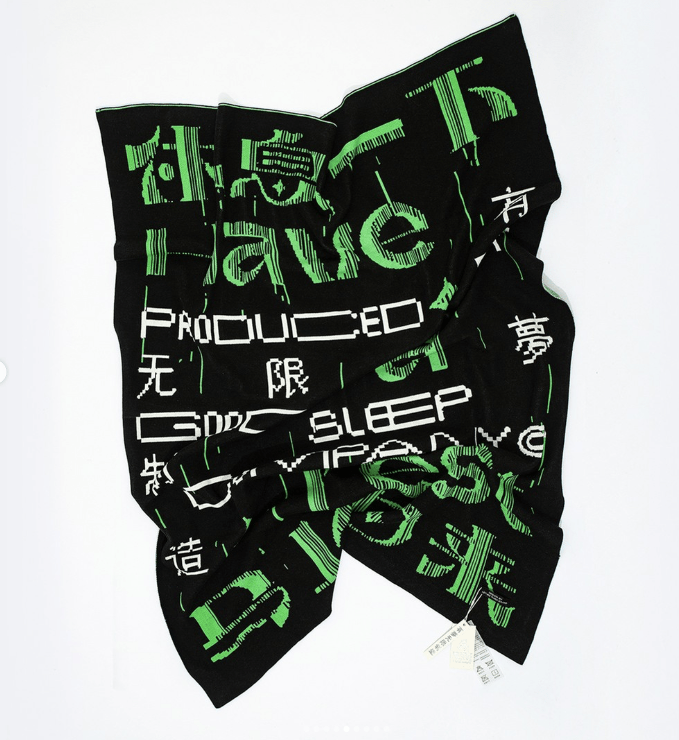
Neo-brutalism or Brutalism in the contemporary sense. It is based on Brutalism as we traditionally know it from architecture or later, for example, poster art. It is characterized by crude forms, strong color contrasts, and shape deformations.
Neo-brutalism often uses a classical layout; in contrast, this layout has raw or deformed elements. Neon colors and black typography are also frequent.
The typography is treated as a highly dominant, distinct, separate element. Neobrutalism does not like pastels, subtle transitions, or corporate slickness. It’s a slap in the face, but despite its rawness, it’s surprisingly harmonious.
Neo-brutalism also characterizes the deconstruction of individual elements, their deliberate overlapping or cutting off, and, for example, their movement (in static visuals, this can be an illusion of movement, such as a blur or the dislocation of movement into stages) or the use of 3D.
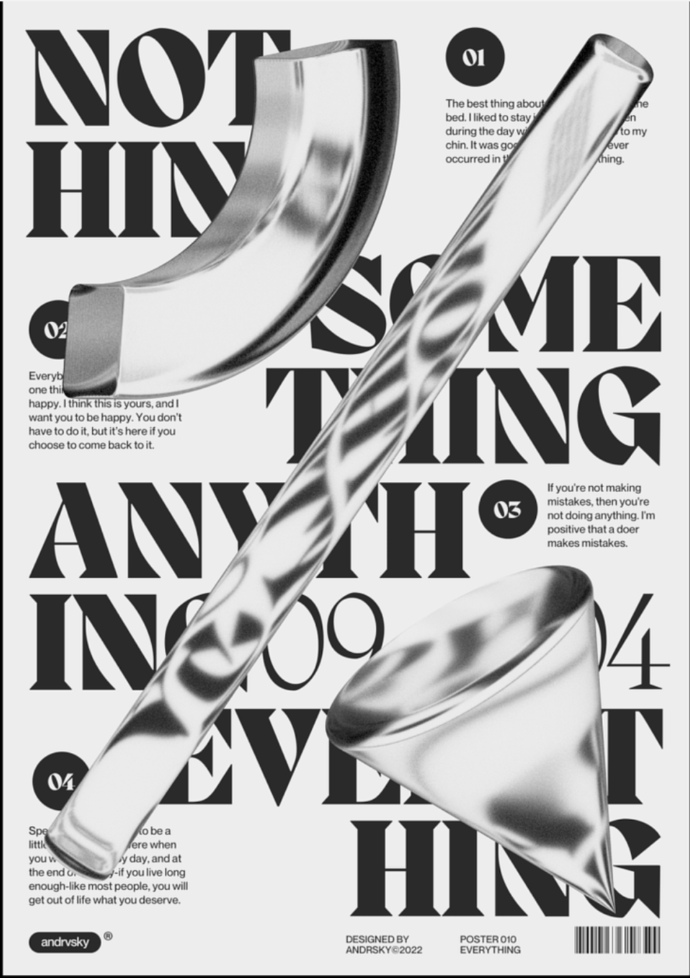
Source: https://dribbble.com/shots/19729415-Poster
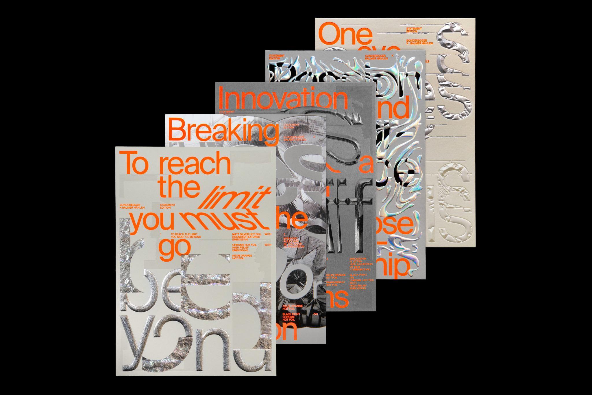
Source: http://twomuch.studio
For example, the Pohoda festival’s visuals work beautifully with a neo-brutalist aesthetic. The layout of the visuals is well thought out and consistent; the neo-brutalist rawness brings them lightness, juice, and perfect recognizability.
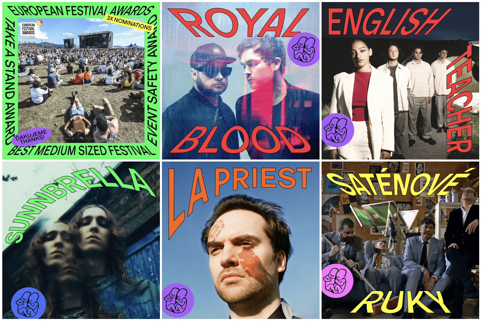
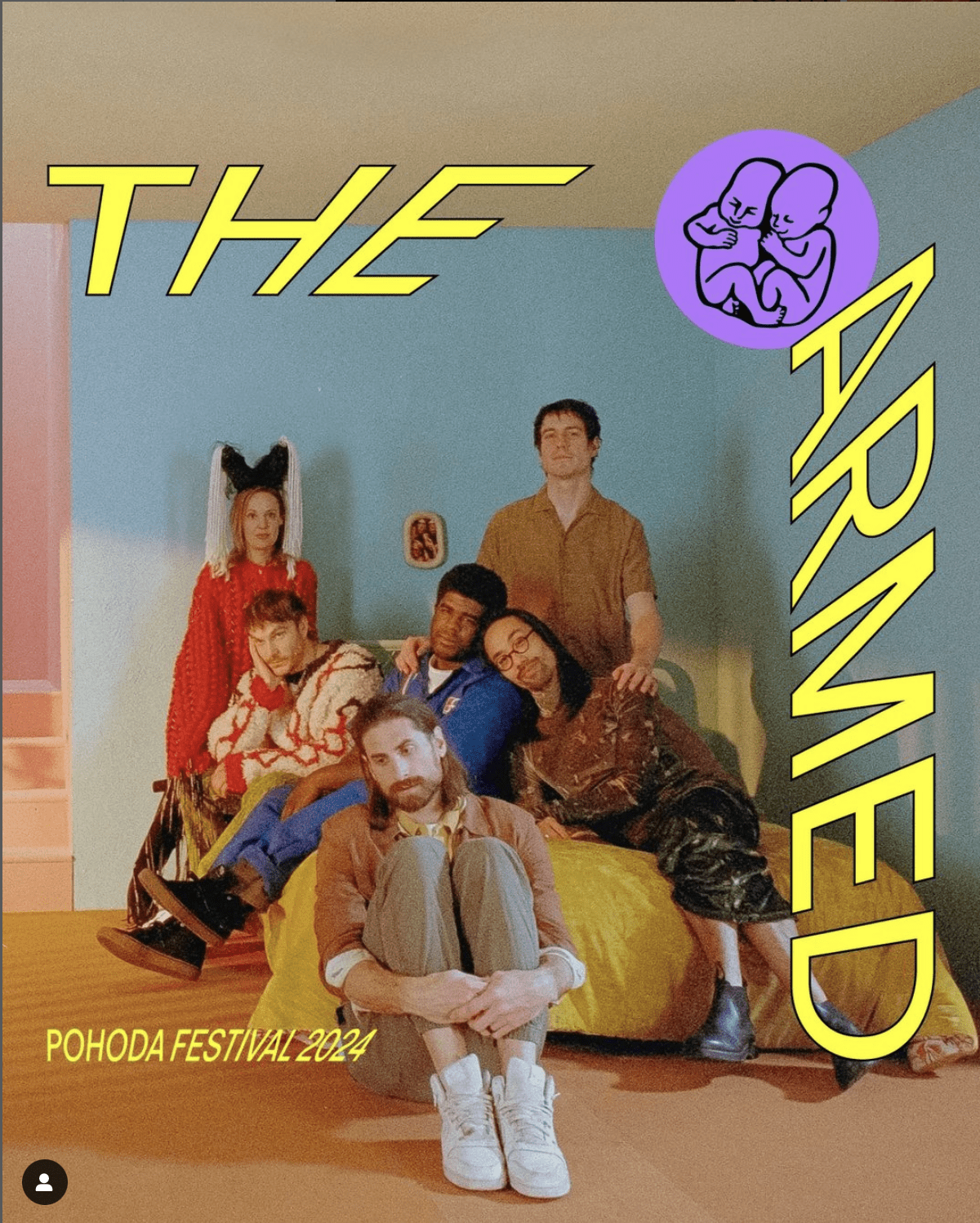
Source: https://www.instagram.com/pohodafestival
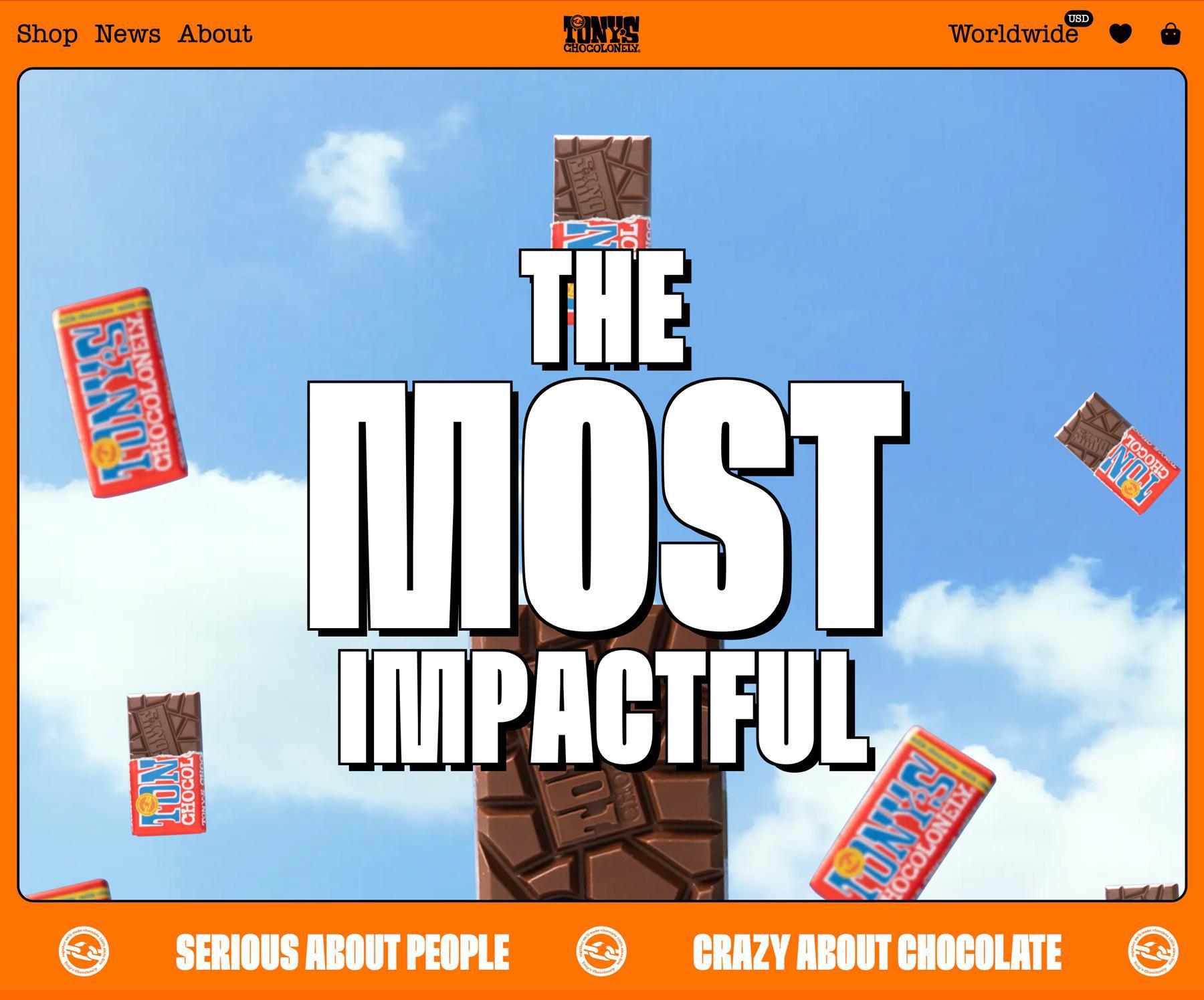
Source: https://tonyschocolonely.tinloof.com/
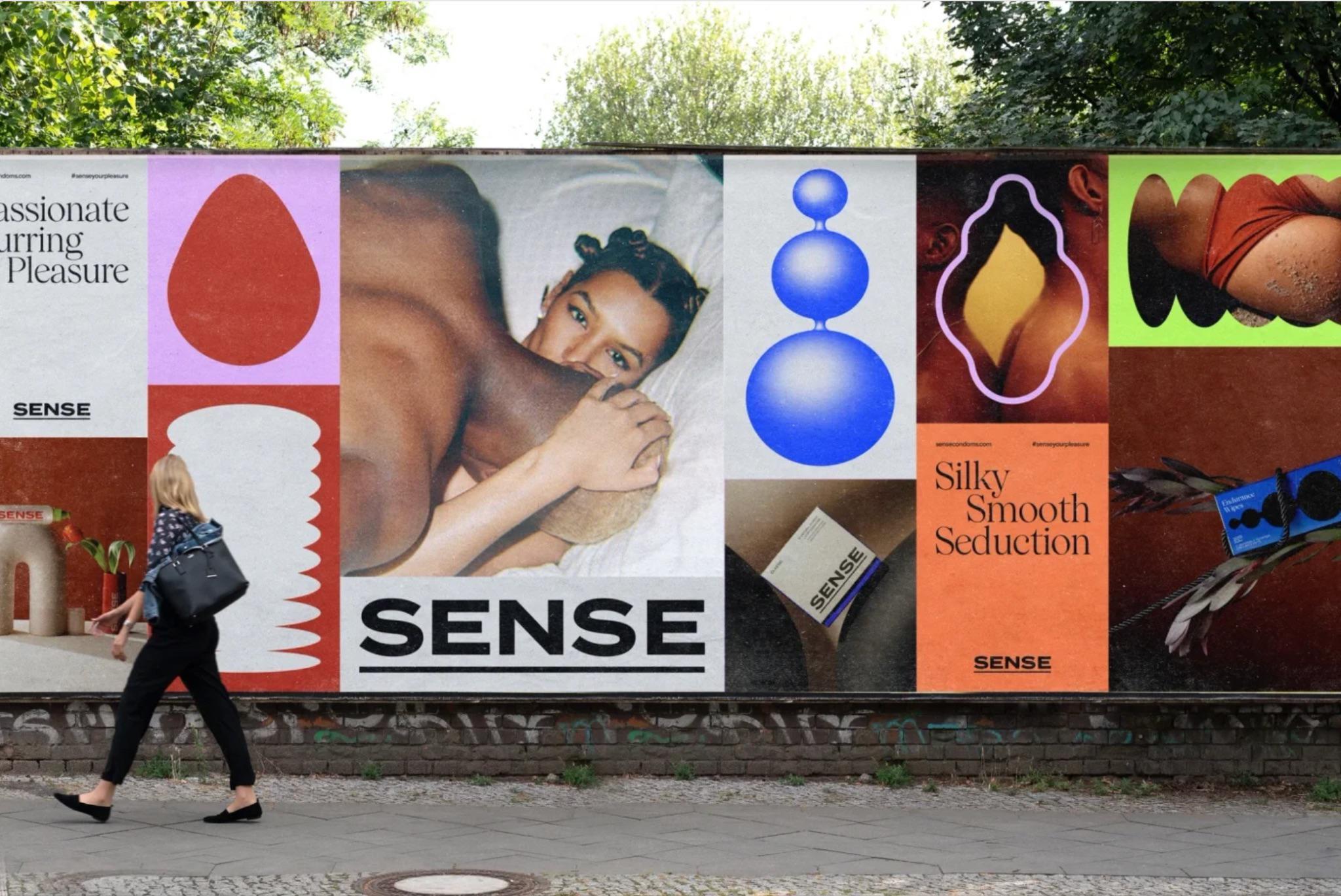
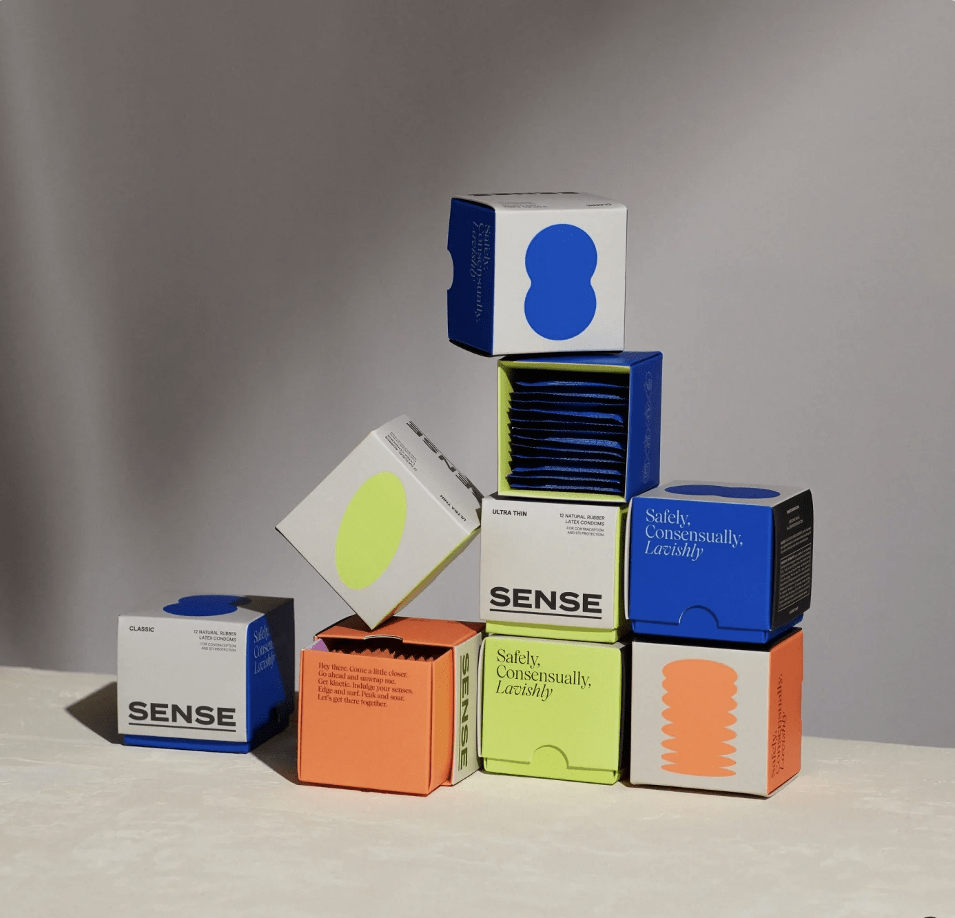
Brutalism is also often seen in combination with minimalism – it’s particularly popular in branding and packaging.
Y2K
The Y2K aesthetic has been with us for several years. It draws inspiration from the turn of the millennium and transforms it into a light and playfully provocative form.
It has a whole arsenal of elements; it does whatever it wants. The Y2K aesthetic is a fun, lighthearted, and unintentional provocation but includes psychedelia, nostalgia, and emotion. It creates its world, a utopia (or dystopia) where anything is possible. And that’s what we love.
Source: https://www.instagram.com/p/CiE8uK_ORWX/?img_index=5
It also translates the digitality of the times, social networks, and multi-genre (e.g., music, game design, AI, fashion).
Source: https://andwalsh.com/work/all/our-branding/
We often see the acknowledged grid (a reference to game design and perspective), melted metals in typography, bright backgrounds, gradients, textures, interactive elements, or emojis. AI elements are used (as in neo-brutalism) in an atypical way. The designer seems to reinvent them and provoke with their use – they are given an aesthetic role. Navigational elements are often more of a raised middle finger to the user than a helping hand.
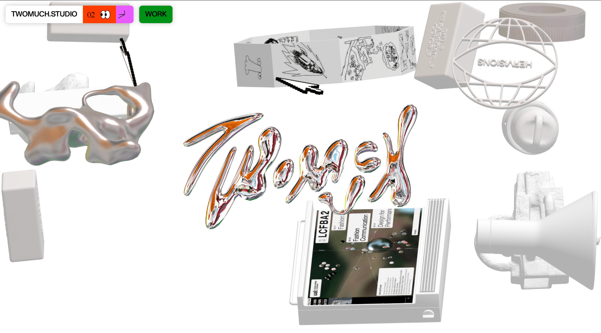
Source: https://twomuch.studio/
FVLCRVM, for example, works nicely with Y2K in his Bad Girls video:
Y2K isn’t a niche thing; even big global brands are fearless about using it if they need to show that they can work with trends or want to set them themselves. Here, for example, is Nike’s Move to Zero campaign landing page:
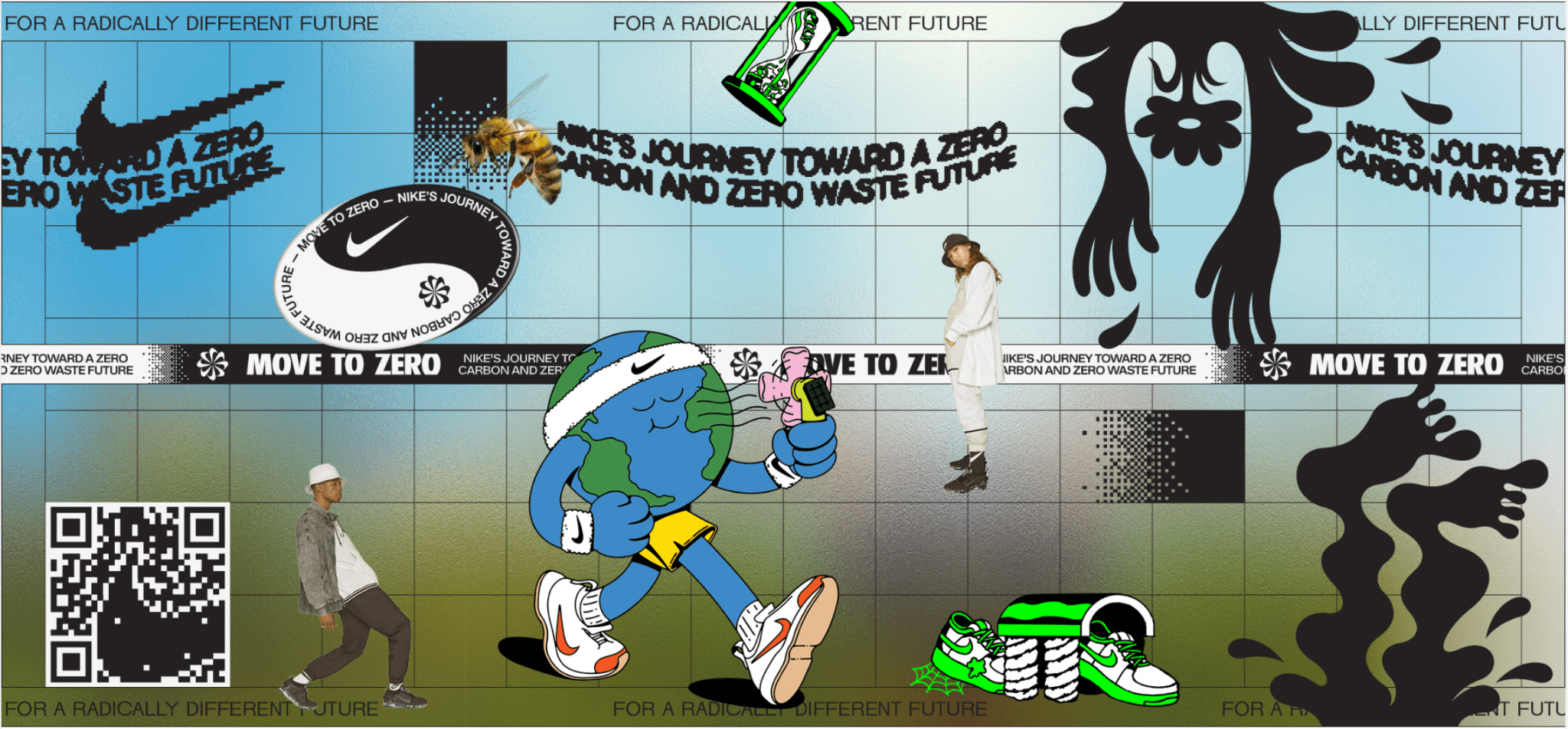
Source: https://www.behance.net/gallery/154037199/Nike-Move-to-Zero-Global-Rebrand
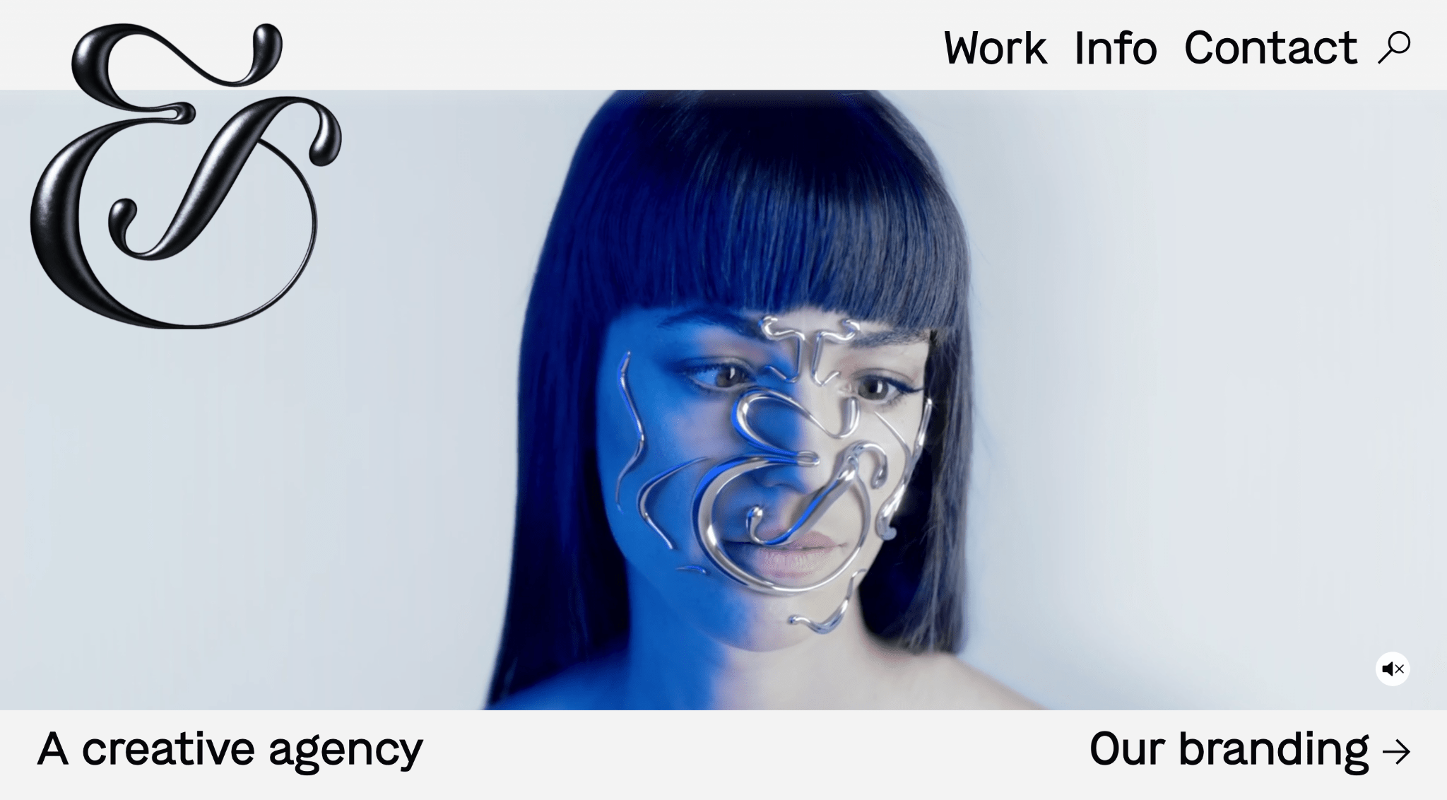
Art Deco
Inspired by Art Deco, this graphic design has been watching us intensively for at least two years and will be with us for a while. It can be seen where a little exclusivity, elegance, or even opulence, mysticism is required. This is reflected in the typography, which takes on a rather decorative character.
It is also often combined with elements of minimalism or product photos inspired by the aesthetics of the 70s (lighting, glow, color), which bring a dreamlike atmosphere.
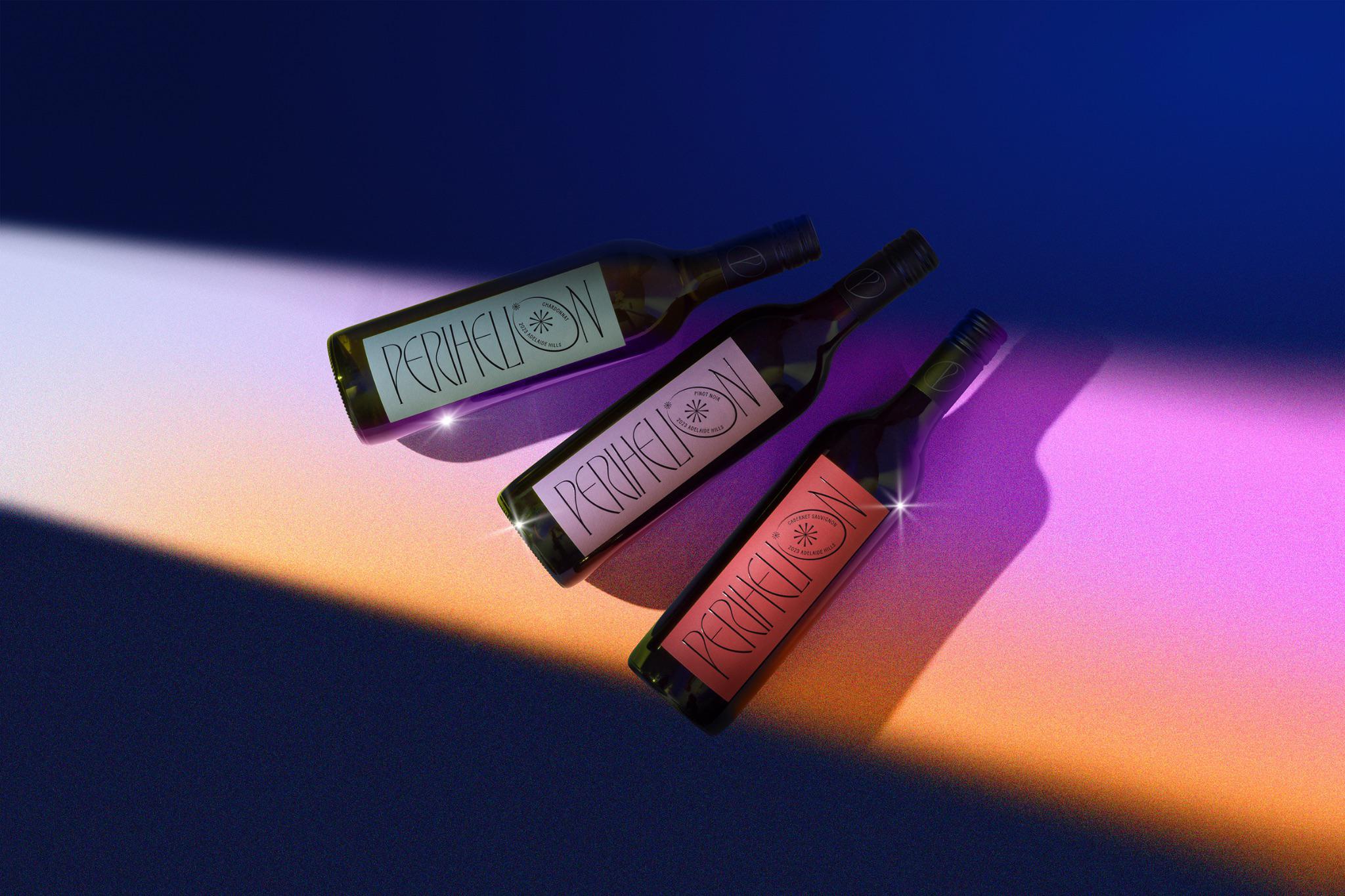
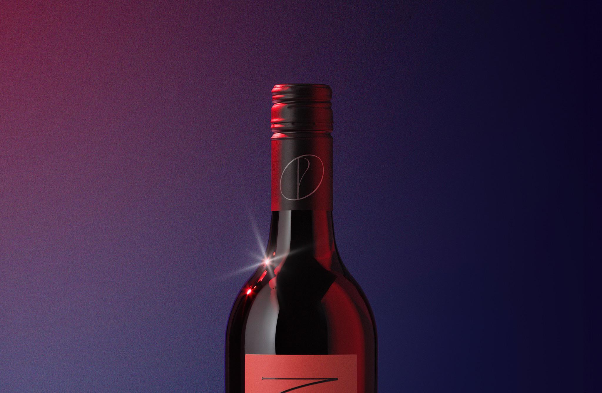
It is not about replicating the Art Deco style but rediscovering what can be recreated using its elements.