Are you creating a website? Don’t forget these 6 steps before you start
No two websites are the same. You may have noticed that some websites make you feel comfortable, peaceful, and harmonious, while others make you feel frustrated and slightly desperate.
If your plan is to create a website that’s more on the harmonious side and that provides a positive user experience, you should seriously consider several key aspects before embarking on the actual coding and design of your website.
The original version of this article was written by Matej Hornik. I only expanded and edited it.
1. Competition analysis
We assume that you already know the topic your new website is going to focus on. For instance, you want to have a website and online shop with handbags. Now what? It’s likely there are already several of these online shops (literally dozens in this case).
You still want to compete with them, so why not discover their strengths and weaknesses?
That will give you a comprehensive overview of how many competitors you have and what’s on their websites. Note down what you like and don’t like about them. In addition, you’ll learn the mistakes to avoid in creating your own website and be inspired by the successes of others in this segment.
What’s the trick?
There are numerous ways to analyse the competition on the market. Let’s start with the easiest one first. Since we’re talking about websites, the simplest thing to do is to identify your competition using a search engine.
As mentioned in the example, you are building an online shop with handbags.
Type “handbags” into the search engine, followed by other keywords expanding on the term “handbags”, such as “best handbags”, “cheap handbags”, “elegant handbags”, etc. Then open all the results (online shops with handbags) that the search engine finds.
Make a note of them in your list of competitors and check them out. Pay attention to the following things on each website:
- the domain name they have,
- the products they offer, their quality and prices,
- their delivery options,
- their website structure,
- how the text, headlines, and descriptions of products and individual pages are written,
- the type of content they publish online,
- if you are building the website using SEO (as you should be! 🙂), what keywords they use, how they have penned the meta descriptions and headlines of their websites.
You can use this information to avoid creating duplicates of competition websites, take inspiration from good examples, and avoid the most common problems and mistakes when building your website.
By doing this, you will end up with an original and optimised website that is outstanding in as many ways as possible.
Pro tip:
We recommend doing a comprehensive analysis of the competition from an SEO perspective, which we have discussed in detail in the linked article. That way, you will gain an overview not only of your competition’s website content, but their strength in terms of Google and organic traffic as well.
2. Keyword analysis
As soon as you know your competition and the direction you would like to take, we recommend proceeding with a keyword analysis. Why?
The most common way to find something on the Internet is via a search engine. If you want your website to be found by as many people as possible in the future, it is important to rank highly for your selected keywords.
We usually identify 2 types of keywords in terms of search queries:
- short-tail – which have a high search volume and contain only 1-2 words, for instance “handbags”,
- long-tail – which usually have a significantly lower search volume than short-tail and contain 3 or more words, for instance “cheap handbags Bratislava brick and mortar shop”.
Sometimes, even we experienced SEO consultants are surprised by the words and phrases people are using to find what they want during a keyword analysis. Hence why it’s important to do it thoroughly and identify even the less common and unlikely search patterns.
What do you gain from this analysis?
A list of keywords that people use to find websites on specific topics, the average monthly search traffic for those words, and the competition for those keywords. To find out how to do a good keyword analysis, read this article on doing keyword analyses by our colleague Marek Šulík, or let us help you with your keyword analysis.
You can then use the gathered data to optimise your site for search engines, for instance to:
- select an appropriate domain name (easy to remember and concise),
- create the structure of the page (individual categories) so that the landing pages correspond to the search queries,
- write good meta descriptions,
- write strong headlines,
- write great text for the website,
- create new content on your website, especially in the form of blog articles.
What does this mean to a layperson?
Since creating original content for your website is crucial (yes, even for online shops for handbags), let’s take the example of writing an article for your blog.
Next time you write a new article or create a new sub-page on your website, go through the results of the keyword analysis first and see if it contains a suitable phrase. Then choose one keyword or phrase and make it the focus of the post.
Of course, avoid using that word or phrase in every sentence. It’s quite sufficient for the word to be mentioned in the title of the article and then 2 – 3 times in the text. If the text is longer, for instance 5 pages, feel free to use it even more.
The most important thing after reading a text written in this way is that everything fits into the context, and the phrases don’t seem to be superficially imposed on the website.
You can read more on how to set up your website for blogging in the linked article by our colleague Jozef Jurík.
3. Website structure setup
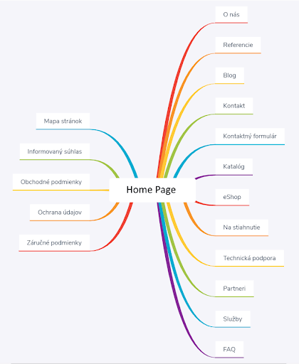
What do we mean by the structure of your website? Basically, it’s the visual design outline containing all the pages and subpages of the website.
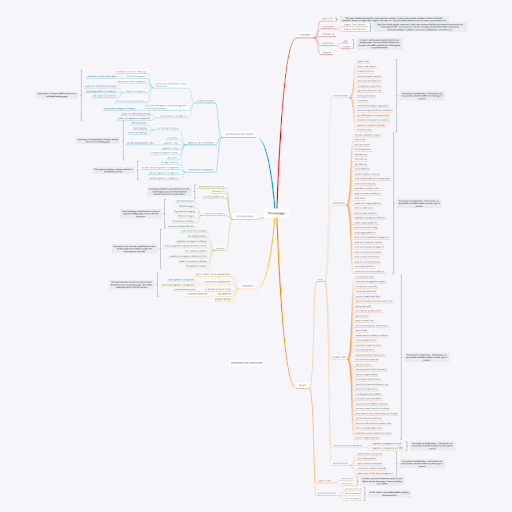
There are many ways to set up your website structure. Many just sketch it out on a piece of paper. But this is all about clarity. That’s why using mind-mapping tools is a neat idea, allowing you to visualise the structure easily, as well as including the links between individual pages (see the example below, created with XMind ZEN).

For a larger website, your mind map can easily end up resembling a spiderweb.

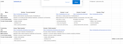
You should also make an Excel spreadsheet, where the spreadsheet represents the website itself, enabling you to add the pages one by one, along with content descriptions.
For inspiration, take a look at the image below, showing the website structure of an imaginary company that makes and sells small and large handbags. It’s a simplified version and the real deal should be much more detailed.

The structure should at least contain the following elements:
- the URL structure (see the article by my colleague Jaro Uram on optimal URL structure),
- the structure of the items in the main menu and sub menus,
- the structure and composition of the items in the footer section,
- the headlines (H1 tags) for the individual pages and subpages, their title tags and meta descriptions,
- ideally, also comments on the actual content of the individual pages on the website.
The more detailed your structure, the easier it will be to build the website itself, and the more problems you will avoid before you start coding and building the website. This will also make the website more transparent and easier to understand for your future visitors.
This way gets you a “bird’s eye view” of your website for the very first time. Thanks to your notes on the content, you will also have a detailed overview of what will be located where, and how the individual pages will link to one another.
Even though it’s quite laborious, this template will prevent unnecessary duplication of content. You might also identify theoretical complications that you can plan for and resolve in advance, translating into a significantly easier website-building experience.
As you may have noticed, the setup of the website structure is very closely related to the setup of the website content. Let’s have a look at what needs to be considered on the content side of things.
4. Website content setup
The cornerstone of any good website is high-quality content. By website content, we don’t just mean the text, but everything it contains. This includes:
- texts and headings,
- images and videos,
- apps (exchange rate calculator, games, etc.),
- other items (CTA elements, etc.)
Why is it a good idea to prepare this in advance? Visitors come to a website in search of information, to educate themselves, buy a product, etc. They don’t just come to glance at the site.
And since you want your visitors to stay for as long as possible and perform as many actions as possible, the content they see needs to be of the highest quality to engage them.
When you separate your content from the other parts of the website, it prevents you from being distracted when creating high-quality, unique content.
From the previous analyses, you should already have an idea of the content your competitors have, as well as what keywords (if any) they are targeting. That allows you to write high-value content that only your visitors will find, while also telling you which keywords to target in your content that your competitors aren’t targeting.
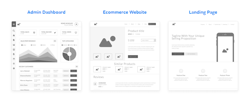
Once you have your content ready, focus on visualising the page itself and its content layout. It’s a good idea to consider the structure of your website, but also the structure of the specific types of landing pages (what the blog article/product page/product category/home page, etc. will look like).
This is where wireframes become helpful.
5. Wireframes and the visual setup of the website

Once you have a basic idea, as well as the actual content that you want to present on the individual pages of your website, the last step is the web design. You might have the best content lying ready, but if you don’t communicate it in a suitable visual form following UX best practices, it may still miss the mark completely.
Hence why it’s very important to have at least basic knowledge of UX and then translate it into the visual itself. In this case, however, we would recommend employing a professional graphic/web designer.
However, should you elect to design the layout of individual elements for a particular type of website yourself, remember to use wireframes. There are many online tools to help you create them, but they are often too complicated for a layperson.
One of the simpler, yet very popular examples is https://wireframe.cc. We also recommend choosing from several templates available from domains such as Moqups.com.
When creating the visual identity of your website, we recommend maintaining visual consistency to make your brand easier to recognise and remember. Choose a primary and a secondary colour that represent your brand and use them consistently throughout the website.
Our design manual will aid you in abiding by the recommendations above.
6. The coding itself
Creating a website doesn’t need to be as complicated as it once was. Unless you want to run a large website with hundreds of subpages, you can create a website relatively easily on your own.
There are several software tools that will more or less “code” the website for you, such as WordPress, for example. You can also find hundreds of manuals to teach you how to use each of these tools.
You can find a category dedicated to websites in our magazine, including tips on building and improving them. Naturally, if you need a more complex website with lots of functionality, you likely won’t be able to do without custom coding done by professionals.
If that’s the case, we can help you and provide a comprehensive web design.
